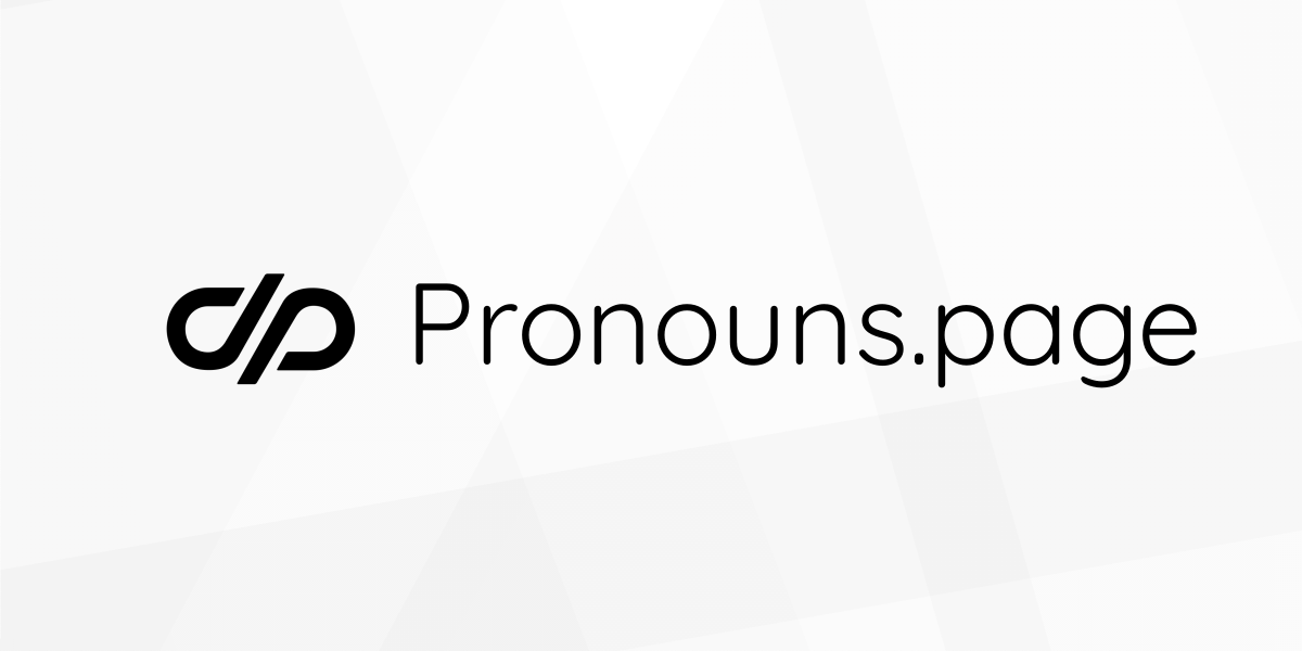
Our new logo
2022-01-28 | Collective
Pronouns.page started as a simple, tiny project – and its logo reflected that fact: it was just a generic icon of tags (representing pronouns and labels). But with more features, more traffic, more users, and more team members came new needs, new ideas, and the talent and skills necessary to make them come true.
We needed a more distinctive logo for the project. And today we are very proud to present it! Look how awesome it looks! 😍

It was designed by 詩央 / Shio. In a simple yet distinctive shape she managed to combine four important meanings:
( / ), pronoun indicator, as in “Alex (they/them)” – to symbolise pronouns,- ԀP – double P – stands for Pronouns.Page
- 中 – a Han character meaning center/middle (pronounced “zhōng” in Mandarin, “chuu” or “naka” in Japanese, “jung” in Korean) – symbolising neutrality (as in: gender neutral language),
- 🔗 – a link symbol – representing human connection.
Thanks to Daniel / Kris we can also present the new logo and the idea behind it using a cool video:
The new logo comes with an extra little feature: Andrea made sure that hovering your mouse over the logo in the header will reveal a flag related to a celebration from the Queer Calendar on the current day.
Hope y'all like it as much as we do 😉